Graphic design is a powerful visual language that communicates messages, ideas, and emotions. At the heart of this language lies typography – a crucial element that plays a pivotal role in shaping the overall design. In this blog, we’ll delve into the world of typography, exploring its definition, importance, rules for graphic designers, and the latest trends shaping the industry.
What is Typography?
Typography is the art and technique of arranging type to make written language legible, readable, and visually appealing. It involves selecting typefaces, font sizes, line lengths, line-spacing, and adjusting the spacing between letters and words to create a harmonious and effective design. While it may seem like a technical aspect of design, typography is, in fact, a creative and artistic discipline that significantly influences the viewer’s perception and understanding of a message.
The Importance of Typography in Graphic Design
- Communication: Typography is a form of visual communication that enhances the message being conveyed. The right typeface can evoke specific emotions or convey a certain tone, ensuring that the design aligns with the intended message.
- Readability: Graphic designers must prioritize readability. Effective typography ensures that the audience can easily and comfortably read the content, preventing confusion and facilitating a better understanding of the information.
- Branding: Typography plays a crucial role in brand identity. Consistent use of specific fonts contributes to brand recognition, making it an integral part of a company’s visual identity.
- Aesthetics: Beautiful and well-thought-out typography can elevate the overall aesthetic appeal of a design. It creates a visually pleasing experience that captures the viewer’s attention and interest.
Rules for Graphic Designers: Typography Best Practices
- Hierarchy: Establish a clear hierarchy by varying font sizes, weights, and styles to guide the viewer’s eye through the content. This helps emphasize key information and creates a visual flow.
- Consistency: Maintain consistency in typography throughout a design. Consistent use of fonts, sizes, and styles contributes to a cohesive and professional look.
- Legibility: Prioritize legibility over ornate or overly stylized fonts. Ensure that the text is easy to read, especially in body copy, to prevent user frustration and maintain engagement.
- Contrast: Use contrast to highlight important information. Contrast in font size, color, and style can draw attention to specific elements, creating visual interest.
- Whitespace: Embrace whitespace to enhance readability and prevent visual clutter. Adequate spacing between lines, paragraphs, and elements contributes to a clean and organized design.
Latest Trends in Typography and Graphic Design
- Variable Fonts: These fonts allow for dynamic adjustments in weight, width, and other attributes, providing designers with greater flexibility and creativity.
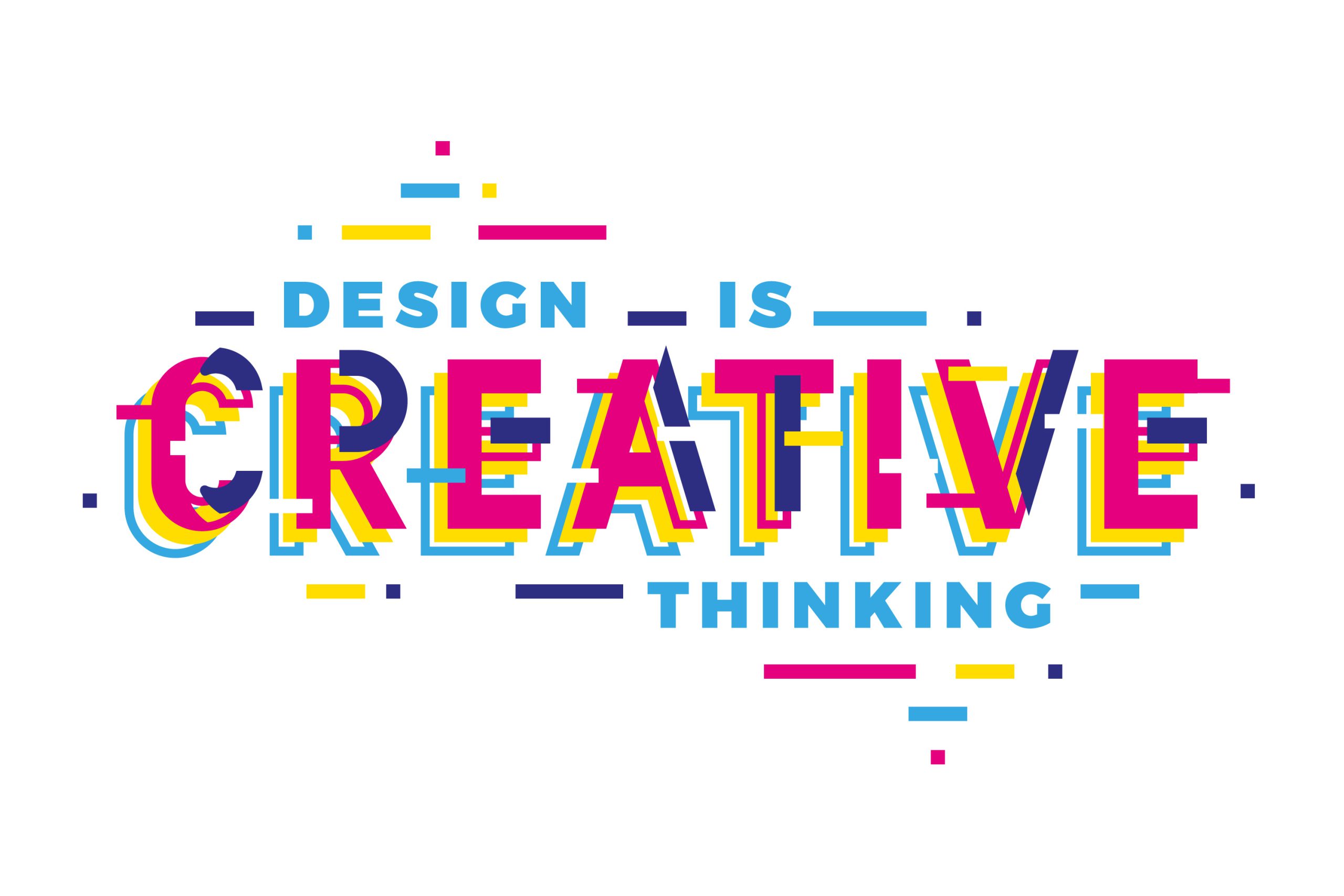
- Experimental Typography: Designers are increasingly pushing boundaries, experimenting with unconventional layouts, font pairings, and stylized letterforms to create unique and memorable designs.
- Colorful Fonts: Vibrant and colorful typography is gaining popularity, allowing designers to infuse energy and personality into their creations.
- Custom Fonts: Many brands and designers are investing in custom typefaces to establish a distinct and recognizable brand identity.
- Mixing Serifs and Sans Serifs: Combining serif and sans-serif fonts in a design can create a visually appealing contrast and balance, adding interest to the overall composition.
In conclusion, typography is a fundamental aspect of graphic design that can make or break the effectiveness of a visual message. By understanding its principles, adhering to best practices, and staying abreast of the latest trends, graphic designers can create impactful and visually stunning designs that captivate and communicate effectively.


